First off, your product has super HIGH potential. Like crazy high potential – I’m excited for you guys. You have the ability to take over Craigslist shopping no doubt; you have an excellent, simple concept and pretty good execution so far (the basics are there). You can definitely steal market share from Craiglist, Etsy, Ebay, and more with your mobile play. The simplicity of it is great for Instagrammers and Milennials when you decide to pursue them. You probably already know some of the stuff below but this is my customer feedback.
FIRST IMPRESSIONS – VISUAL DESIGN
1. Overall App is Visually Unappealing.
The font is horrendous. I was actually hesitant to adopt your product because it was so unappealing. It didn’t seem like a legit app and looks like third-party scam app mining my payment information. However, I knew you guys were legit because my coworker mentioned you before in an retail news discussion – not because he used it but because we were in CorpDev.
Next, the color is horrible. It’s an outdated old color – maybe with the right font, you could make it work. Eventually, you’ll want to redesign the logo, font, colors to reach the masses (idk, maybe that’s what Uber was thinking).
Please redesign the logo, font, and colors (especially the popup fonts).
MARKETING
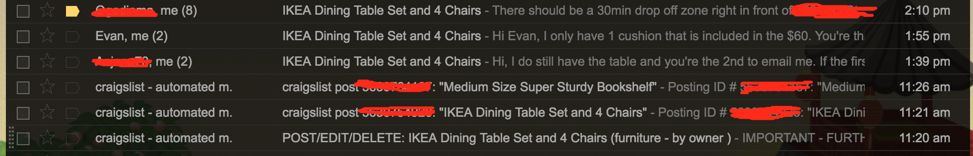
2. Put your call-to-action FIRST in the title of the email.
The welcome email. Great job on sending it instantaneously after sign-up – that definitely increases open and click rates. However, all I read was “Thanks for using OfferUp” and I didn’t open it and moved on to posting. I didn’t confirm my account until after further investigation of the email. To avoid people skipping over your call-to-action FIRST – that bar “|” separator is too strong. You need to be like Craigslist below and make it explicit. What is your open rate on welcome emails? It isn’t 100% and then what’s the confirm rate? Always A/B test the suggested change.

3. Build a Mass Audience that Buys AND a Mass Audience that Sells.
I started my Craigslist and OfferUp posts for the exact same product and product description at pretty much the same time (within mins of each other). I wanted to see if posting on OfferUp was worth my time and alas not really; I thought that, since OfferUp was “local” and from Bellevue, WA, it would be useful for Seattle. I posted on Craigslist at 11:20am and received the first Craigslist response at 11:54 am, the second at 1:39pm, and the third at 1:55pm. All during that time, no one replied via OfferUp and after the third Craigslist reply email, I deleted the Craigslist and marked OfferUp as sold. Craigslist: 3. OfferUp: 0. Game over.
Maybe run some dummy Craigslist tests to see how good you’re doing at marketing and building a base relative to competitors – have it be a quasi-metric.
APP FUNCTIONALITY: BROWSING
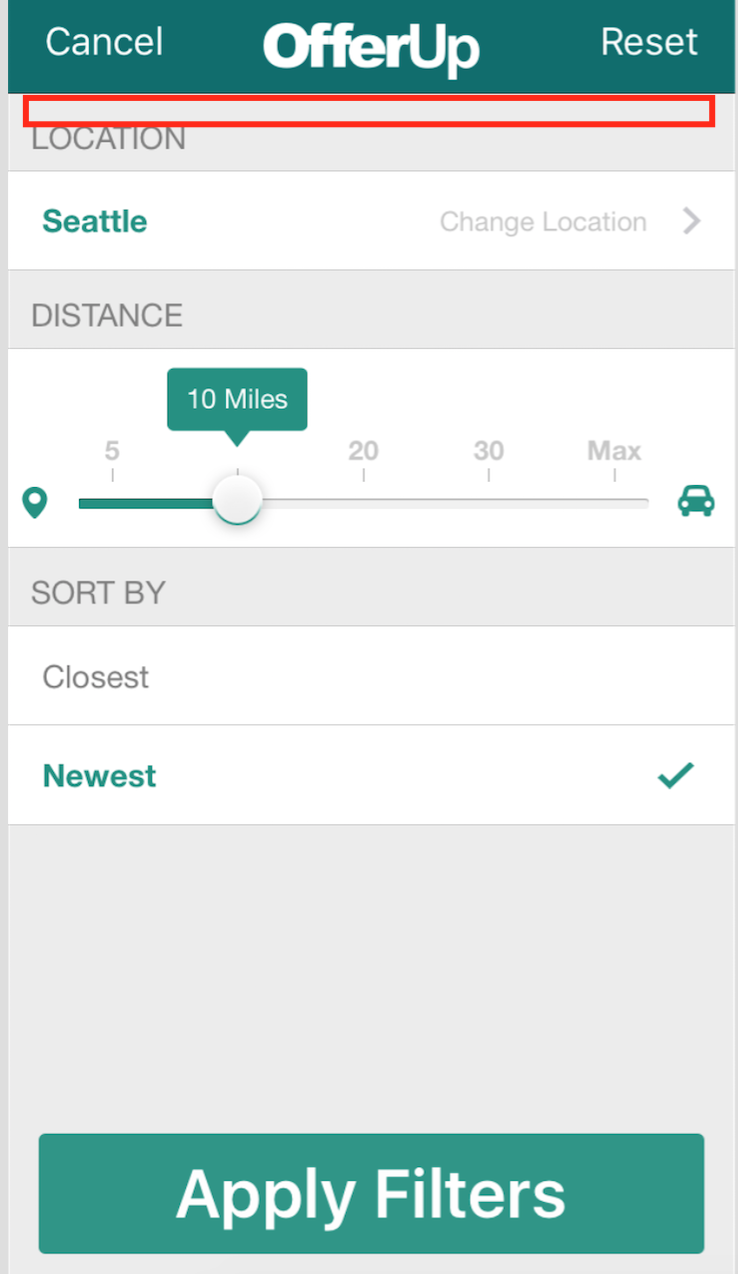
4. Add Category as a Filter Option.
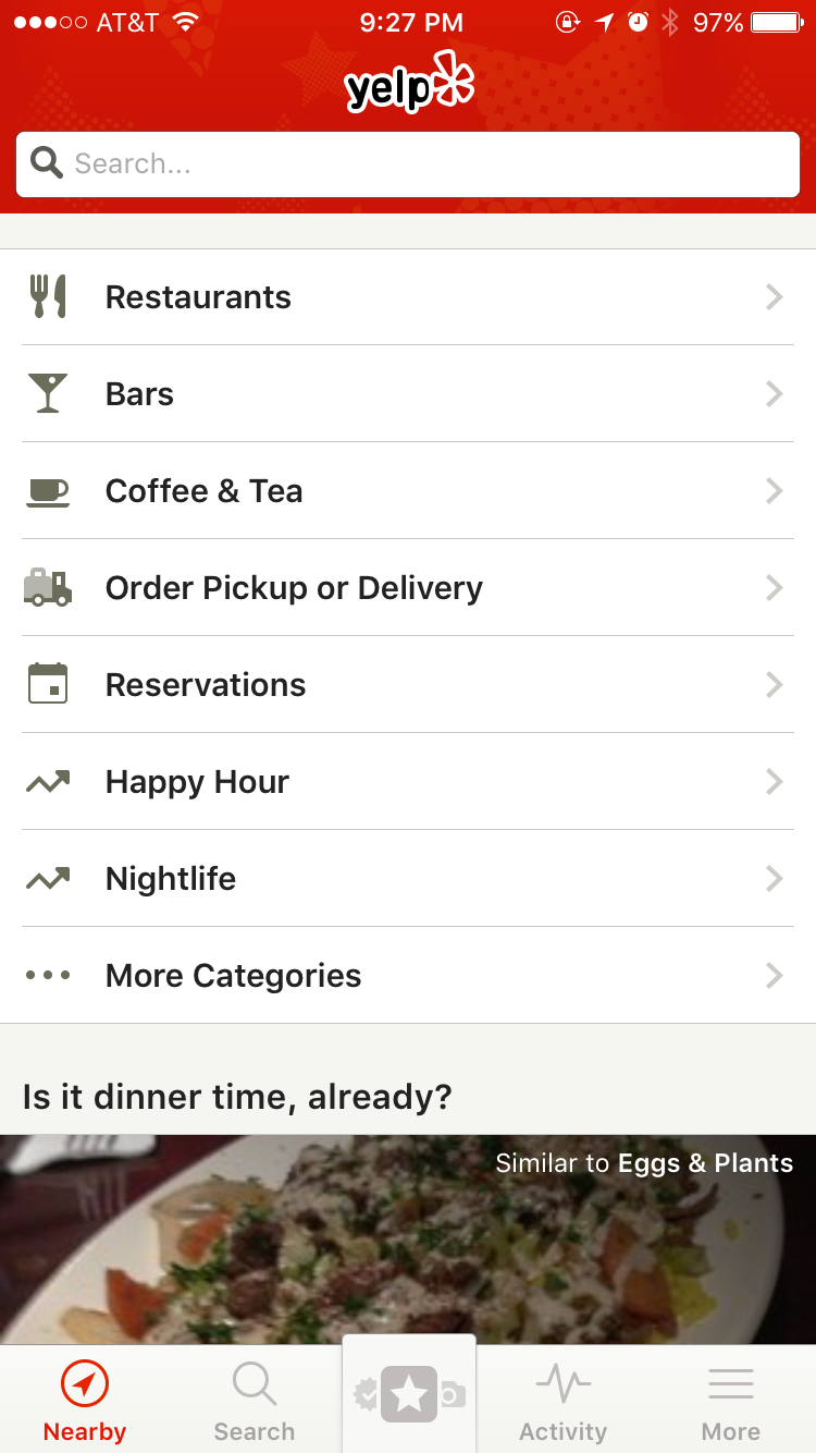
You are offering a very limited amount of filters right now and you need to add a dropdown of categories. Then users can immediately switch from category to category without going back to the Browsing homepage – less friction. That way, users can come to OfferUp for random browsing and also choose OfferUp to look for something specific and let’s be real – e-commerce is very search driven right now and people are molded to be search-oriented. Don’t narrow yourself and make the app painless and workable for both use cases (discover shopping and search shopping). Add categories as a filter – see Yelp comp below.
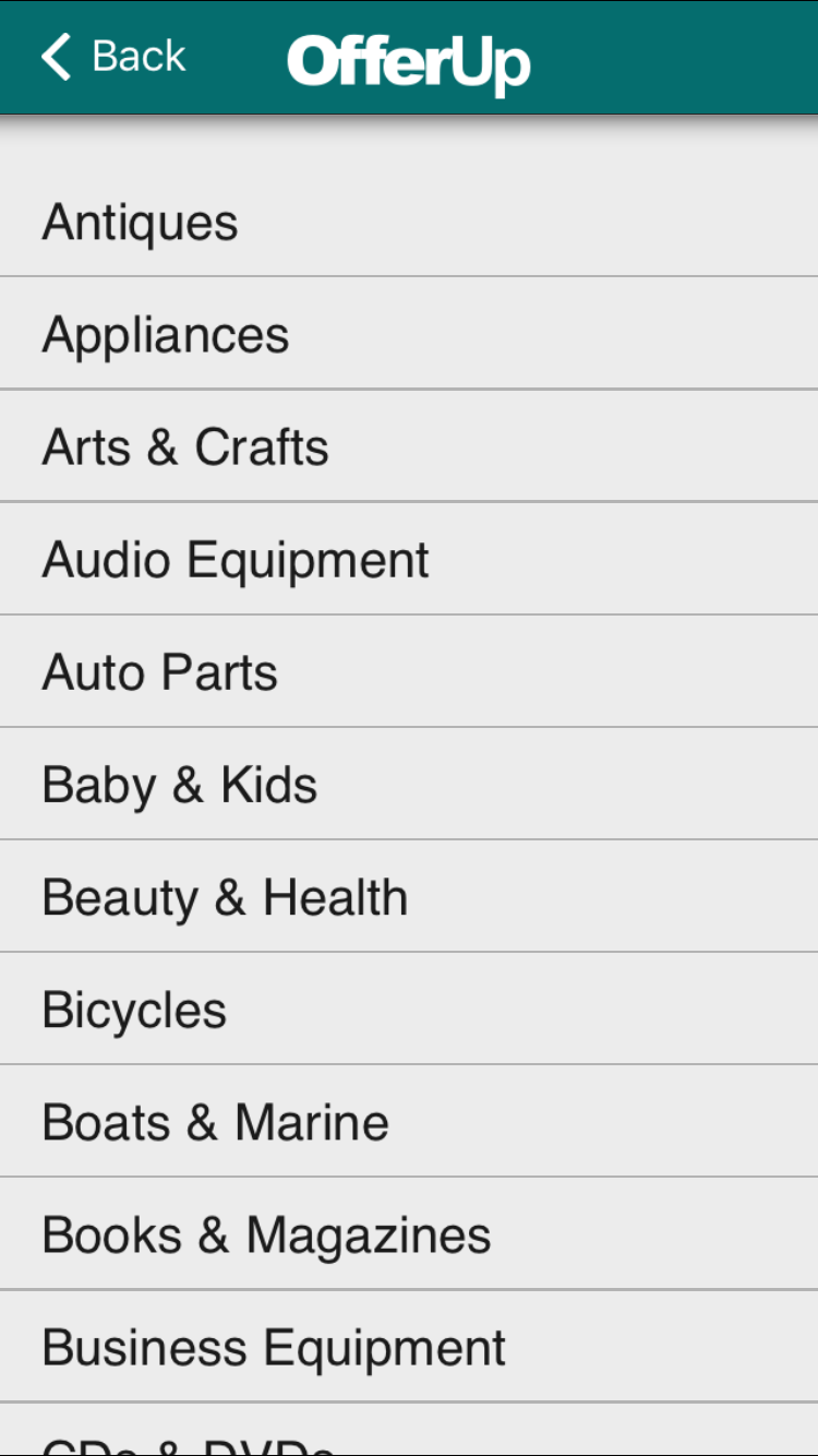
5. Add Icons Next to Categories.
Your entire app lacks icons except for the bottom toolbar. This makes your app very wordy and boring and the bottom toolbar icons are little ambiguous but okay. Add more visual aids and icons throughout the app.
There are a bunch of free and/or cheap commercial ones or have your designer to draw and build one for each of your categories. Some people are visual creatures and learners; I know I am. The HR portion of your website has icons to express information quickly. Some of the best, most non boring PowerPoints are picture based; your app is picture based! Let that mentality flow throughout the app via icon signage.
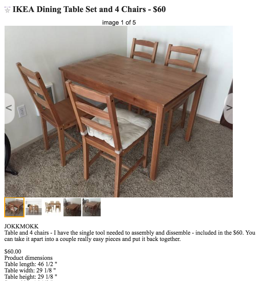
6. Use Real Images Under Browse.
Under Browse by Category, are the category cover photos pictures of real items I can buy now? If they are, you should have that cover image item show up at the top of the search or near the when I click into the category. If they are not, I would recommend standardizing the images than use fake intro photos that I can’t buy. You’ll notice Ebay is unrecognizable these days. No more shitty auction and consumer pictures; most are third-party, professional quality vendor photos. They’re moving away from auction-based and moving towards a normal e-commerce marketplace company appearance. You bet they A/B tested their redesign and this was the better choice. Of course, I’m not saying put professional photos because that would be deceptive but I do hope you’re putting high quality, high rated photos of stuff I can actually buy. That will definitely help click-throughs. Put your most popular items, most clicked available items as the covers.
Obviously professional images signals higher quality and are more desired. Even if you’re a platform for cheap bargains, you should aim higher as low-income buyers are aspirational and cheap does not always imply crap. It really can be value like Dollar Store and Walmart offer. Improve your photos and cover photos!
7. Buying Tab – Revisit the Ambiguous Money Tag Icon
I have no idea what the money tag does or is. It’s poorly designed. Label your icons at the bottom (like Yelp, Whatsapp, and Twitter does).
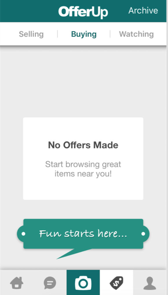
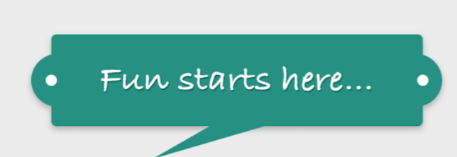
8. Buying Tab – Make the “Fun starts here” image clickable to the correct location.
When you’re on the money tab and you choose “Buying,” you have this green box is not clickable. It’s a giant box and it took me forever to realize that it may be pointing to something. It appears when the customer has NOT made an offer on anything which is ridiculous because the fun would NOT start with the notification section – you should be pushing the new user to use your product by shopping around. So, 1. the button is not intuitive that it is pointing to something and 2. it is directing the new user to the wrong location. Get on it.
9. Selling Tab – Make the “Offer up something!” clickable.
Reduce the friction in the flow. The new user has made no offers and you need to direct them to the right place. Also, the center graphic doesn’t look like an arrow pointing at the camera. All the empty space is vague and confusing.
10. Watching Tab – Make “No Items Being Watched” clickable.
Why is the format of the “No Items Being Watched” different from the other tabs? This is just poor design as design should be consistent throughout the app. Is this design/white square clickable? No. Should it be? Yes. Make it easier to push users to do the actions you want them to do. Push your users to go watch something by linking directly to the place they can go watch.
APP FUNCTIONALITY: POSTING
11. Enable multi-image selection and upload.
Make it easier for the customer to post multiple photos. Remove the barriers to users only posting one photo. The more convenient it is to post multiple photos, the more details for the buyer and the more willing the buyer will be able to make a decision to purchase or not purchase. The more photos, the better and the more details, the people will buy (if it’s a good product). I’ve work in e-commerce for one and a half years and I already know that a huge barrier to purchase and a major source of unhappy customers is a dearth of photos for a product and lack of detail in the product description. and then not getting what they expect – Enable multiple photo selection upload – up to four pictures.
12. Consider Restructuring your Categories.
When you build out your analytics team – eventually it will be huge and have data scientists – you’ll have to have categories that you can determine what are the best ones. And you’ll want granularity and the more detail, the better. I could not for the life of me figure out where to post Purse- general? Honestly, it should be it’s own section. I put under jewelry and accessories but it was a kid’s backpack. Not sure where to put it. Baby and Kids? For now, I wouldn’t allow multiple. It’s gonna eff up your analytics. Maybe you want to offer tags like blog post tags. a nice to have feature.
13. Remove the default category selection that remains from previous posts.
When you start posting, the lasted post you do determines the preset category. This will result in MANY MISCLASSIFIED items. People will post multiple items of multiple categories sequentially and the latest category should not be determining the next category. -Also, don’t forget to add the icons. That way it double confirms the item is in the right category.
14. Instead of Optional, you should use the word “recommended.”
The more descriptive and more details you include about the item helps customers make better decisions, builds trust, and makes messages that are sent more effective for the buyer and the seller. Make sellers do the legwork instead of making both parties send meaningless, pointless, unnecessary messages back and forward.
15. Push people to enable notifications at every step – have alerts that pop-up to encourage notification adoption after key user actions (messaging/posting).
Especially for people who interact witht he appp – sent a messag or posted, they MUST have he notifications enabled. In addition to the beginning where you ask them to enable, you should have reminder pop-up notifications.
APP FUNCTIONALITY: EDITING
16. Enable Single Action Step Editing.
It’s annoying I have to go through all four steps again to edit my description to add more detail. make it so you can move through and edit any part of the . In craigslist, in 1 click, you can edit any part of the post. screnshot of craiglist
BUGS and BEYOND
17. Your “From People I follow” is broken.
you have a bug. How the heck do I follow people? Who should I follow? I found some other bugs but maybe you already have open tickets on them.
18. Create a recommended/suggested list of local people to follow.
Just like how instagram, etsy, and twitter sets you up to follow people.
19. Remove TruYou.
No one knows what TruYou is. Maybe want to think about Facebook or other more popular profile validoations – not a big deal – eventually hopefully you’ll have profiles like Airbnb hosts have.
20. Consider third party integration on the payments front.
Perhaps venmo/investigate your braintree options. Note: I say all of these things not knowing what your monetization strategy is so adopt/consider accordingly.
Overall, I think you guys are off to a nice start. I’m not seeing you guys adopting best practices from giant e-commerce mobile and non-mobile players Ebay. You have the power to become the next Pinterest x Craiglist. Good luck OfferUp! I hope you get a large base soon so I can make money by selling things.
![]()